Six Month Lag

Inflation, finance, economics.

Mild Core PCE inflation report for April 2025

Core PCE inflation flatlined in April. The six month lag shows 2.6% inflation, with the 3 and 12 month clocking in at a virtually identical 2.7% and 2.5%. Probability of rising inflation is 60%, close to a 50-50 coin toss. There is little or no obvious evidence of the on and off trade war: monthly goods prices declined in both March and April.


Economic Dashboard, First Edition

Economic statistics circa Dec 2024 and what has happened through April 2025.

Josh Marshall challenged his readers to create an economic dashboard to track the economy’s performance during the Trump administration. My attempt isn’t a side-by-side comparison with the two administrations (that can come later), but rather a snapshot of the economy inherited and what has happened since.

Unemployment and inflation are about where they were at the end of last year, at least through April. Unemployment rose by a trivial tenth of percentage point and progress on inflation has stalled above the Fed’s 2.0% target.

Inflation adjusted GDP declined in the first quarter. The mild 2 quarter annualized growth rate in the bottom right-hand corner is based on nowcasts by the St Louis and New York Federal Reserve. New York updates weekly; St Louis updates more often. The New York website provides a fair amount of detail including a range of probabilistic estimates. They say that there’s a 68% chance that growth will end up somewhere between 0.73% and 3.94% — quite a wide range.

Expanded dashboards could include manufacturing employment, output, and productivity growth, overall productivity growth, and median wage growth. Energy independence could be measured with the difference between nationwide energy production and consumption. I could also include mortgage rates.


Core PCE inflation ticked upwards in February and March

The April 30th PCE report ran through March 2025, before Liberation day tariffs were announced on April 2nd. The headline PCE price index rose 2.3% relative to a year ago, down from 2.7% the previous month.
Underlying price pressures are better captured by stripping out food and energy: this is reflected in the core PCE metric. It rose by 2.6% relative to a year ago. The six month measure favored by this blog rose by 3.0%, down slightly from 3.1% from the previous month and well above the Fed’s target of 2.0%. There’s a 75% chance that inflation is rising, as measured by centered 1 year inflation.


Two Alternatives To the Six Month Percentage Change in Prices Have Inferior Performance

I’ve emphasized percentage changes over various time spans so far, but there are other ways of reporting the growth of any given prices series.

This inflation formula was preferred by the late Kevin Drum. It’s a 3 month moving average of one month annualized percentage changes. Practically speaking, it’s equivalent to the annualized 3 month percentage change. It’s almost perfectly correlated with it, and the difference between the two is less than rounding error 99% of the time.

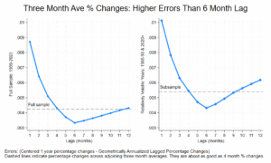
We can also look at the annualized percentage change between adjoining 3 month averages. Using one year centered inflation as a baseline, it has higher errors than the six month percentage change: it does about as well as the 4 month percentage change. Here are the error charts for the full sample and the sample where inflation was more volatile. The dashed lines indicate the 3 over 3 month average errors:

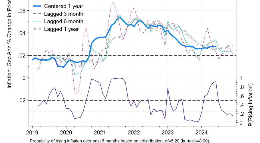
Any 5-8 month percentage change will outperform this metric. You can see that the six month percentage change is visibly better in this timeline:


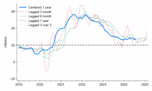
The thin green lines are generally closer to the thick blue lines, relative to the orange dashed line. The 3 over 3 version is superior to the 3 month percentage change: its correlation with the next month’s 3 month percentage change is .994, where 1.000 is perfect correlation. The 3 over 3 is in a sense more up to date than the 3 month percentage change, but both are noisy.

Ok, but what about 4 over 4, 5 over 5, etc.? None are superior to the 6 or 7 month lag. The percentage change in adjoining four month moving averages represents the sweet spot in this approach, though they are still inferior to the 6 or 7 month percentage change. 4 over 4 has errors only a little higher than the five month percentage change.

Bottom line: stick with the 6 or 7 month geometrically annualized percent change.

Fine Print: All annualization is geometric annualization: see my earlier post or my paper for details. The 3 month moving average is always slightly greater than the 3 month percentage change. Differences can be as high as 2/10ths of a percentage point when inflation is very low (less than 1.5%). The first chart shows mean absolute errors for annualized percent changes at various lags.


Core CPI report for Jan 2025, released Feb 12, 2025

CPI data reweighted by Jason Furman

Core CPI increased 0.4% in the month of January, with headline CPI increasing 0.5%. Over the past year all items CPI increased by 3.3%. Bloomberg reports that Federal Reserve Chairman Powell state, “I would say we’re close, but not there on inflation.”

Over at Bluesky and X, Jason Furman presents the CPI report, with prices reweighted to track the PCE: see the image above. He notes that his weights have been overestimating the PCE figures lately, so perhaps the PCE-equivalent adjustment should be moderated. The one month figure is too noisy to pay attention to. The one year figure is dated. My appendix shows that the 6 month figure is the sweet spot for Core CPI as well. With 6 month inflation at 3.4% and rising, we are a ways from the Fed’s long run 2.0% target.

If you must forecast, forecast often. That said, based on this report I would expect a shift to more restrictive language in the Fed’s statement during the March 18-19 meeting barring a very dramatic shift in the data between now and then.


Core PCE inflation report for December 2024, released on January 31, 2025

Core PCE prices rose 2.8% over the preceding year, the same as last month’s report. The six month annualized figure was somewhat more reassuring, dropping from 2.4% to 2.3%. Given this data, we would expect centered inflation to be lower than it was 6 months ago with 85% confidence, based on historical experience and ignoring what we know about future tariff increases.

The six month annualized lagged percentage change is a better predictor of centered one year inflation than other lags. The six month perspective suggests that as of December 2024, the Fed was making steady progress towards its goal of 2% inflation. The higher 2.8% figure should be interpreted as the level of inflation in the economy as of 6 months ago. In the graph the 2 indicators show some contrast: the green 6 month lag shows a modest decline while the blue bars showing the 12 month lagged percentage change are relatively flat.

Bear in mind though that we’d expect an average divergence of 0.7% between the six month figure and the expected centered 12 month figure. Prospects of higher tariffs moving forward increase estimated uncertainty and suggest less complacency regarding future inflation. But as of December 2024 at least, inflation was declining towards its long run target.


Review of Core PCE report for November, Released on Dec 20, 2024, Part II

Here is a more proper update of the graph in my paper, reflecting the inflation data as it was initially reported at the time, relative to the revised centered one year percentage change in prices represented by the thick blue line.

The data starts in March 2019, because there were delays in reporting core PCE prices due to a US government shutdown in Dec 22, 2018 to Jan 25, 2019. The updated graph reflects similar data on the right of the chart, with 6 month annualized inflation being slightly lower than inflation measured over the previous year, and inflation generally easing over the previous six months.


Review of Core PCE report for November, Released on Dec 20, 2024

With the next PCE report coming on Jan 31, 2025, I thought I would review the report released last month. The above graph is a little different than the last post as it only uses the latest revised data and doesn’t bother to dig out inflation rates as they were originally reported. Comparison of the red, green, and inchworm lines, as well as the purple probability line, with the last post shows that the effects of the approximation are more than trivial.

One year core PCE inflation came in at 2.8%: inflation over the past year gives us an idea of general price pressures as of 6 months ago, halfway through the time span. The annualized six month lag provides the best estimate of centered inflation as of November 2024: that was 2.4%, a little lower.

Price pressures eased: given historical experience we’d expect November’s centered inflation to come in lower than centered inflation in May (6 months prior) about 80% of the time.

The Federal Reserve has a long term target of 2.0% inflation: the latest report indicates steady progress towards that goal as of November 2024.

ETA Jan 26, 2025: See the next post for a much better graph.


One month centered inflation vs annualized 3, 6, and 12 month lagged inflation

Centered 12 month inflation and 3, 6, and 12 month lagged inflation. Also the probability that inflation rose over the past 6 month. 2019-2024.

I showed a chart plotting errors for various annualized lagged percentage changes in a previous post. Here we can get an idea of what they look like. This chart from my paper shows annualized lagged percentage changes relative to underlying contemporaneous inflation as measure by the one year centered percentage change shown in the thick blue line. The red dashed line shows three month lagged percentage changes: they move around too much to provide insight into the underlying trend. The one year lagged percentage change, which is generally reported as the contemporaneous inflation rate, provides a somewhat outdated perspective (six months outdated) to existing underlying inflation. The sweet spot is in the six or seven month range: the thin green line shows the annualized six month percentage change. It fits the thick blue line visibly better than the 2 alternatives shown.

The bottom half of the chart indicates inflation’s direction, whether the centered thick blue line is rising or falling over the previous 6 months, something which is only known retrospectively. Formally, it is the probability that inflation is rising: when it is above say 80% it predicts rising inflation and when it’s below say 20% it predicts falling inflation. The probabilities are based on the price data alone. Such lack of sophistication is helpful to the extent that at least the forecast process (or rather the nowcast process) can be readily understood, unlike models where there are many contributing variables.

The data goes through July 2024 and reflects the late August report. I hope to post something more up to date soon.


Annualization

.


There are a number of ways of taking a one month or six month percentage change and stating it in annual terms, for apples-to-apples comparisons. The simplest method is to just multiply by 12 in the case of one month or 2 in the case of the six month percentage change. I call that simple annualization, though it could also be called multiplicative annualization. It does not reflect compounding: twelve consecutive monthly percentage changes of 1% will result in a percentage change of 12.68% over an entire year, somewhat over 12.00%.


To take compounding into account, use a formula like this for monthly percentage changes:

\( Geometrically \, Annualized \, Inflation = \left [ \left ( \frac{P_m}{P_{m-1}} \right )^{12}-1 \right ] *100 \)


A similar formula could be used to annualized 6 month percentage changes:

\( Geometrically \, Annualized \, Inflation = \left [ \left ( \frac{P_m}{P_{m-6}} \right )^{2}-1 \right ] *100 \)

Above, the current month’s prices are divided by prices 6 months ago. To inflate them, they are taken to the power of 2 (since there are 2 six-month periods in a year). Further discussion and a more general formula are presented in the paper. Simple annualization isn’t an awful approximation for geometric annualization, but there’s no reason not to insert the proper formula into your spreadsheet.