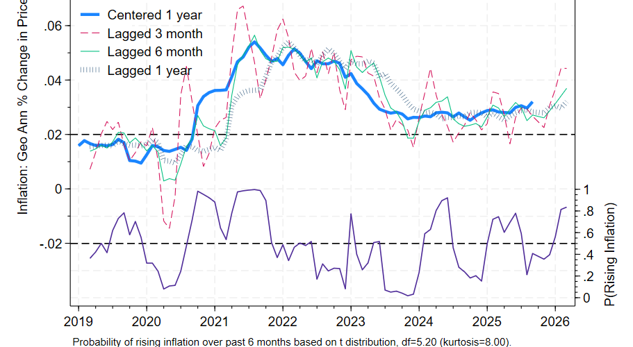
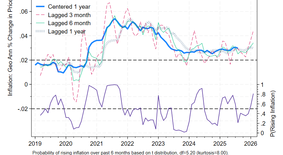
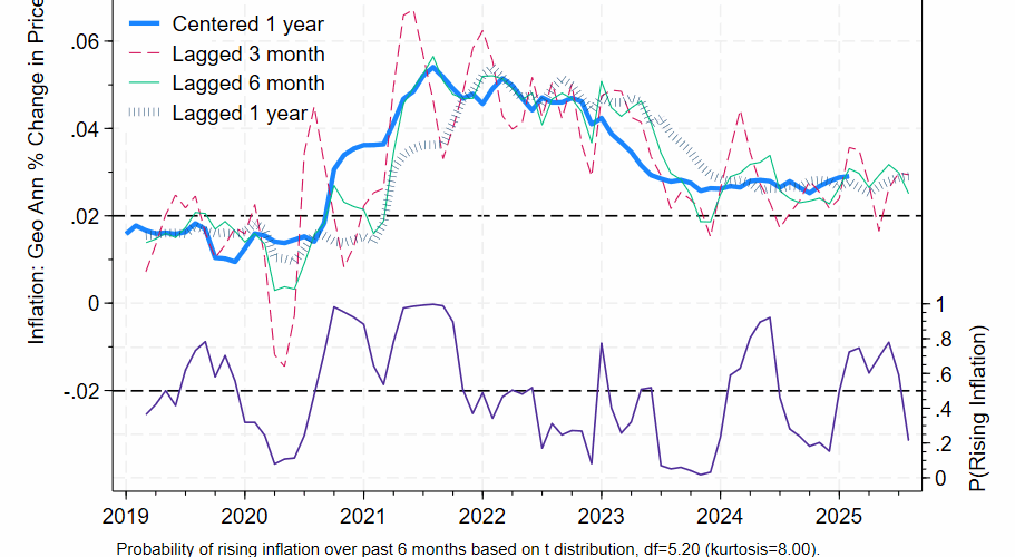
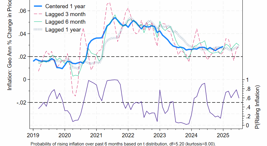
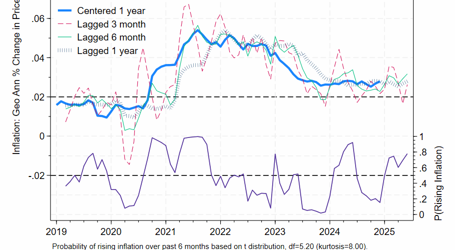
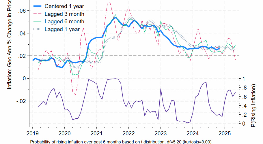
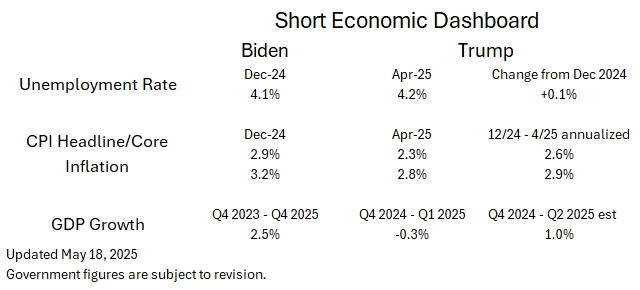
Six Month Lag

Inflation, finance, economics.

Cumulative real output: who built America and when was it built?

US production of goods and services now stands at around $30 trillion dollars per year. This compares with output of $6.2 billion in 1790 in inflation adjusted numbers, using 2024 prices. That’s a multiple of over 4600. Population rose 87 times through 2024, while per person output rose 54 times.

We can calculate a moving sum of all output produced since 1790: it totals 1070 trillion dollars. Growth in GDP is a compounding process and cumulative GDP grows even faster. So over half of all output produced since 1790 was churned out this century. Half before 2001, half after 2001. Three quarters of all output created since 1790 was produced after 1980. And a whopping 90% of all output has been produced since 1956.

I don’t want to make too much out this calculation. Education, stable institutions, and a market price system are prerequisite for high income economies not wholly reliant on resource extraction. But to the extent that human and physical capital are embedded in GDP (strictly speaking, they are not the same though we’d expect a rough correlation) what the nation has produced and consumed since 1790 is mostly a result of the sweat and capacity of those who working in living memory.

Data taken from Measuringworth.com; prices updated to 2024.


Six Month Lag Implies Low Inflation, but that’s due to an Unusually High Value In Feb 2025

The six month lag for Friday’s Core PCE report came in at 2.5% for August, down from 3.0% the previous month. The probability that centered 1 year inflation rose over the previous 6 months also fell to 21%. The 3 and 12 month figures were higher at 2.9%.

While 3 and 12 lagged inflation is far worse at predicting one year centered inflation than the 6 month lagged inflation, we need to be wary of data artifacts, in this case the unusually high price report from February 2025. We can guard against misinterpretation by bracketing our preferred measure with 5 and 7 month lagged inflation, which have nearly the same predictive power as 6 month inflation. Those 2 figures came in at 2.8% and 2.9%, respectively. Bottom line, the story is similar to last month, implying stable inflation of around 2.9%.


Core PCE Inflation Stable at 3.0%

The 3, 6, and 12 month annualized percentage changes show similar core PCE inflation: they are pegged at 3.0%, 3.0%, and 2.9% respectively. Inflation is stable, albeit at a higher level than the Fed’s long run 2.0% target.
Economic historian and macroeconomist Brad DeLong has long argued that the 2.0% inflation target is too low. I tend to agree: we’ve come uncomfortably close to deflation three times over the past 30 years, which is three times too many. By my reckoning, we are at an inflation sweet spot and should tighten if inflation creeps upwards and loosen if it trends too far downwards. But the Fed’s official goals differ and they are properly concerned about their credibility with price setters. Even if the 2.0% target isn’t the best we could do, it’s the one that the economy has shaped itself around.
The market believes that the Fed will lower the Fed Funds target rate by a quarter percentage point after the September 16-17 meeting and that this week’s job report will be an important input into their reasoning. I interpret last Friday’s PCE inflation report as being relatively tame.


What a difference a day makes!

Job numbers came in surprisingly low, previous monthly figures were revised downwards, and the unemployment rate ticked up slightly. President Trump fired the head of the Bureau of Labor Statistics (BLS); the stock market dropped 1.6%. A member of the Federal Reserve Board of Governors resigned early. The odds of a Fed rate cut next September soared from 40% to 80%, properly I think. If you must forecast, forecast often.

It should surprise nobody that this website is a supporter of high quality, nonpartisan, and objective data collection. Just today I joined Friends of the BLS. I encourage my readers to do the same.

https://www.friendsofbls.org


Core PCE report for June implies inflation above 3.0%

The six month annualized lag indicates that core PCE inflation crossed the 3 percent threshold, moving from 2.9% to 3.2%. The headline one year percentage change, which measures inflation centered on December 2024, increased from 2.7% to 2.8%.

The probability that one year centered inflation in June 2025 will be higher than centered inflation in December 2024 has risen to 78%. That is by no means a sure thing, but it’s fair to say that inflation is probably increasing.

The next Fed rate setting meeting is scheduled for September 16-17. There will be another PCE report available by then, as well as an additional CPI report. According to the CME group, fed fund futures imply a 39% chance of a rate cut in September. That seems a little high to me, though not unreasonable.


Core PCE inflation report for May 2025: trending upwards

The one year percentage change for May’s core PCE report came in at 2.7%, which gives an idea of 1 year inflation centered on November 2024. The best forecast of inflation centered on May 2025 is the annualized six month percentage change, which was a slightly higher 2.9%. The probability that centered inflation has rose over the past 6 months is at 69%.

Inflation is somewhat elevated and probably increasing. The Fed Funds is at 4.3%: subtracting out 2.9% gives an estimated real rate of 1.4%. Since January 2000 that figure averaged at *negative* 0.1%, but during the 1990s it averaged + 3.9%. So the fed funds rate is little high for this century, but not anywhere near as tight as it was during the 1990s.


Mild Core PCE inflation report for April 2025

Core PCE inflation flatlined in April. The six month lag shows 2.6% inflation, with the 3 and 12 month clocking in at a virtually identical 2.7% and 2.5%. Probability of rising inflation is 60%, close to a 50-50 coin toss. There is little or no obvious evidence of the on and off trade war: monthly goods prices declined in both March and April.


Economic Dashboard, First Edition

Economic statistics circa Dec 2024 and what has happened through April 2025.

Josh Marshall challenged his readers to create an economic dashboard to track the economy’s performance during the Trump administration. My attempt isn’t a side-by-side comparison with the two administrations (that can come later), but rather a snapshot of the economy inherited and what has happened since.

Unemployment and inflation are about where they were at the end of last year, at least through April. Unemployment rose by a trivial tenth of percentage point and progress on inflation has stalled above the Fed’s 2.0% target.

Inflation adjusted GDP declined in the first quarter. The mild 2 quarter annualized growth rate in the bottom right-hand corner is based on nowcasts by the St Louis and New York Federal Reserve. New York updates weekly; St Louis updates more often. The New York website provides a fair amount of detail including a range of probabilistic estimates. They say that there’s a 68% chance that growth will end up somewhere between 0.73% and 3.94% — quite a wide range.

Expanded dashboards could include manufacturing employment, output, and productivity growth, overall productivity growth, and median wage growth. Energy independence could be measured with the difference between nationwide energy production and consumption. I could also include mortgage rates.


Core PCE inflation ticked upwards in February and March

The April 30th PCE report ran through March 2025, before Liberation day tariffs were announced on April 2nd. The headline PCE price index rose 2.3% relative to a year ago, down from 2.7% the previous month.
Underlying price pressures are better captured by stripping out food and energy: this is reflected in the core PCE metric. It rose by 2.6% relative to a year ago. The six month measure favored by this blog rose by 3.0%, down slightly from 3.1% from the previous month and well above the Fed’s target of 2.0%. There’s a 75% chance that inflation is rising, as measured by centered 1 year inflation.


Two Alternatives To the Six Month Percentage Change in Prices Have Inferior Performance

I’ve emphasized percentage changes over various time spans so far, but there are other ways of reporting the growth of any given prices series.

This inflation formula was preferred by the late Kevin Drum. It’s a 3 month moving average of one month annualized percentage changes. Practically speaking, it’s equivalent to the annualized 3 month percentage change. It’s almost perfectly correlated with it, and the difference between the two is less than rounding error 99% of the time.

We can also look at the annualized percentage change between adjoining 3 month averages. Using one year centered inflation as a baseline, it has higher errors than the six month percentage change: it does about as well as the 4 month percentage change. Here are the error charts for the full sample and the sample where inflation was more volatile. The dashed lines indicate the 3 over 3 month average errors:

Any 5-8 month percentage change will outperform this metric. You can see that the six month percentage change is visibly better in this timeline:


The thin green lines are generally closer to the thick blue lines, relative to the orange dashed line. The 3 over 3 version is superior to the 3 month percentage change: its correlation with the next month’s 3 month percentage change is .994, where 1.000 is perfect correlation. The 3 over 3 is in a sense more up to date than the 3 month percentage change, but both are noisy.

Ok, but what about 4 over 4, 5 over 5, etc.? None are superior to the 6 or 7 month lag. The percentage change in adjoining four month moving averages represents the sweet spot in this approach, though they are still inferior to the 6 or 7 month percentage change. 4 over 4 has errors only a little higher than the five month percentage change.

Bottom line: stick with the 6 or 7 month geometrically annualized percent change.

Fine Print: All annualization is geometric annualization: see my earlier post or my paper for details. The 3 month moving average is always slightly greater than the 3 month percentage change. Differences can be as high as 2/10ths of a percentage point when inflation is very low (less than 1.5%). The first chart shows mean absolute errors for annualized percent changes at various lags.