January 31, 2025
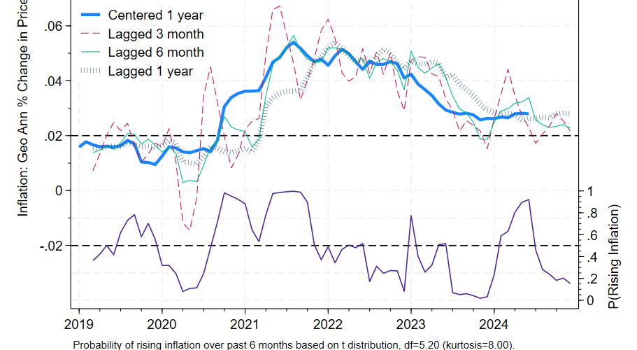
Core PCE prices rose 2.8% over the preceding year, the same as last month’s report. The six month annualized figure was somewhat more reassuring, dropping from 2.4% to 2.3%. Given this data, we would expect centered inflation to be lower than it was 6 months ago with 85% confidence, based on historical experience and ignoring what we know about future tariff increases.
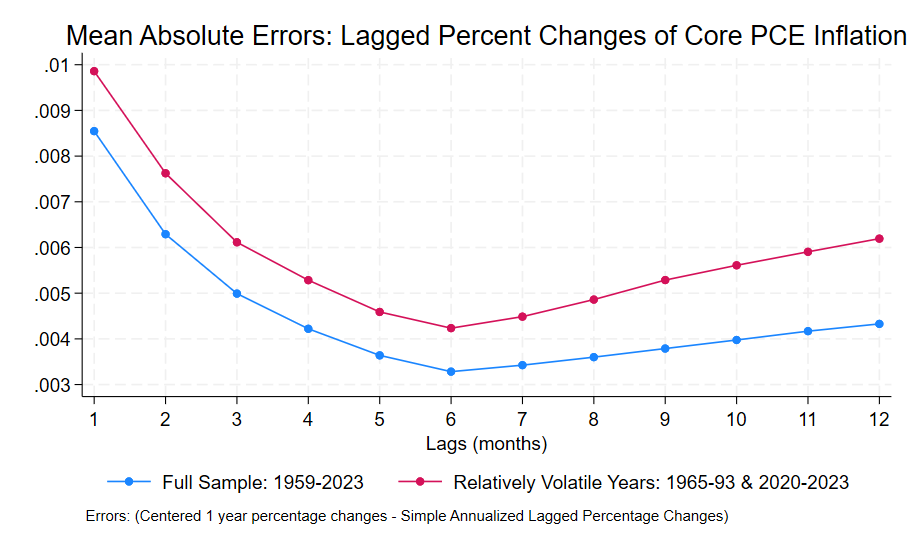
The six month annualized lagged percentage change is a better predictor of centered one year inflation than other lags. The six month perspective suggests that as of December 2024, the Fed was making steady progress towards its goal of 2% inflation. The higher 2.8% figure should be interpreted as the level of inflation in the economy as of 6 months ago. In the graph the 2 indicators show some contrast: the green 6 month lag shows a modest decline while the blue bars showing the 12 month lagged percentage change are relatively flat.
Bear in mind though that we’d expect an average divergence of 0.7% between the six month figure and the expected centered 12 month figure. Prospects of higher tariffs moving forward increase estimated uncertainty and suggest less complacency regarding future inflation. But as of December 2024 at least, inflation was declining towards its long run target.


